Microsoft today released the first preview build of Windows 11 to those in the Dev Channel of the company’s Windows Insider program. If you have joined the Insider program and meet Microsoft’s new — and somewhat complicated — system requirements for the new operating system, you should see the update soon.
This first preview includes most of the new features Microsoft has promised for Windows 11, including the new look and feel, themes, widgets, the new snap layouts and the updated File Explorer. But there are also some features that didn’t yet make the cut for this first release. Support for Android apps and the new built-in Teams integration, for example, are coming in a later release, but a preview of the new Windows Store is already available today.
Otherwise, though, you’ll get to try out the new Start menu for example (and fret not, you will be able to move the start button to the bottom left if you don’t like the centered look — but you won’t be able to move the entire taskbar to another side of the screen). And while the Start menu is an iconic part of the Windows experience, most power users probably never use it and instead use their keyboard or the taskbar to start 99% of their applications. Still, Microsoft is trying to do something different here with its new “recommended” section that highlights newly installed apps and recently used files.
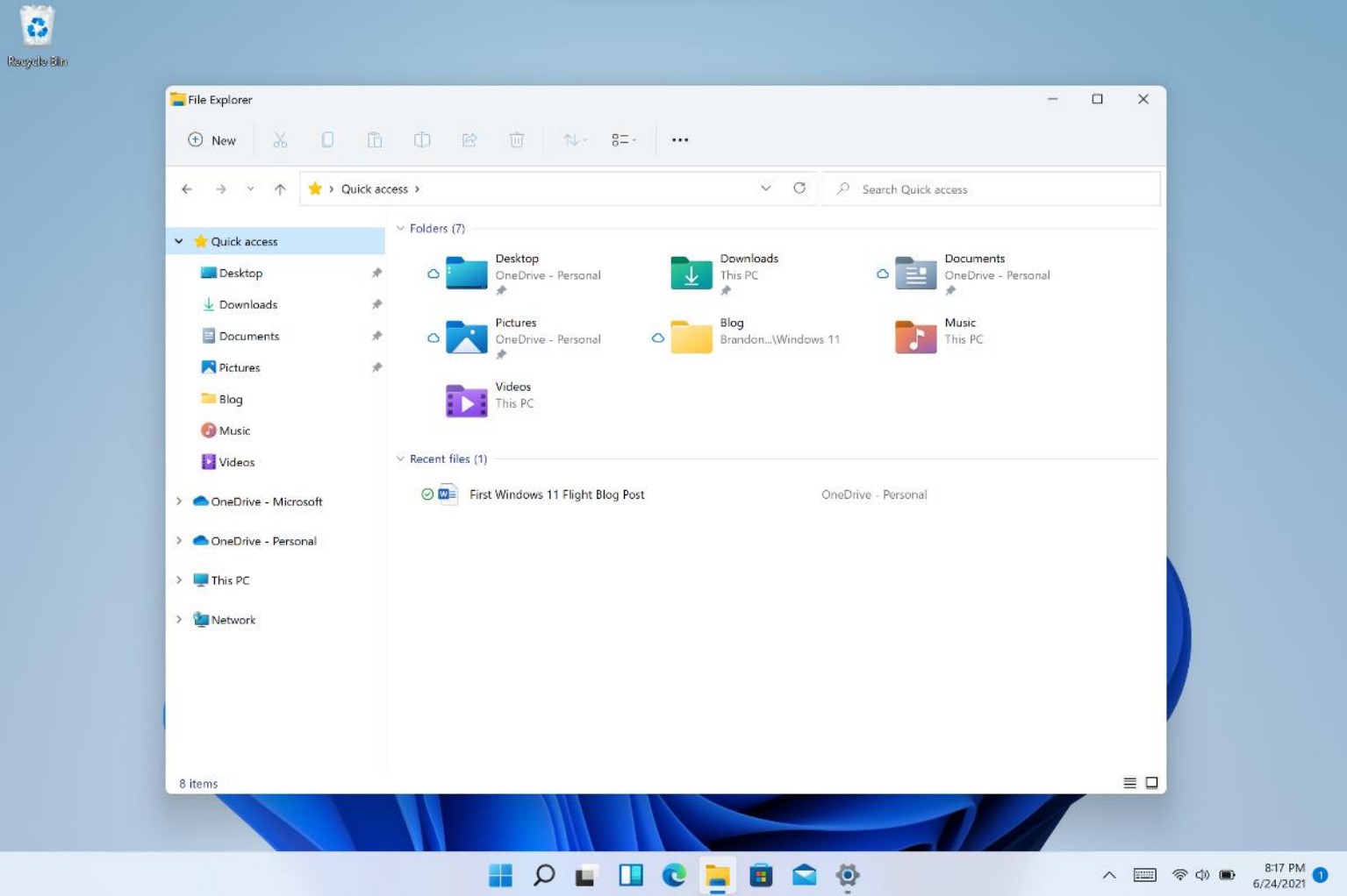
Another new feature you’ll likely spot right away is the new File Explorer, which now does away with the ribbon-style menu in favor of a flatter look (Microsoft calls it a ‘command bar’) and new, more modern icons across the board. It looks good, but we’ll have to give it a try to see if it hasn’t lost a lot of functionality in the process.
The File Explorer, just like every other app in WIndows 11, will also feature support for Microsoft’s new Snap layouts, which take the existing ‘snapping’ gesture or keyboard shortcuts in Windows that let you snap windows to any side of the screen and brings it to the maximize button. While the overall functionality isn’t new here, I’m pretty sure that a lot of Windows users never knew it existed, so this new feature will introduce window snapping to a lot more users.
The new widgets, too, are now prominently highlighted in the taskbar. Right now, there are calendar, weather, local traffic, Microsoft To Do and stocks widgets, as well widgets that show you recent photos from OneDrive and sports and esports news if that’s your thing. There’s also a personalized new feed.
The last new feature worth mentioning here is the new Settings menu. Ever since the ill-fated Windows 8, Windows essentially had two settings menus (the Control Panel and Settings). It looks like those confusing days aren’t over just yet, but the new Settings menu at least looks a lot cleaner than the existing one in Windows 10.
There are, of course, plenty of other changes in Windows 11. This is definitely more than just another bi-annual Windows 10 update with a few minor UI changes. Now we’ll just have to see how all of this works in the real world — though keep in mind that this is still an early release. The preview is now rolling out to Insiders, so we’ll likely hear more about how it performs soon. We’ll also put it through its paces in the coming days, too.


