Vivaldi has always been one of the more interesting of the Chromium-based browsers, in no small part thanks to its emphasis on building tools for power users in a privacy-centric package, but also because of its pedigree, with Opera’s outspoken former CEO Jon von Tetzchner as its co-founder and CEO. Today, the Vivaldi team is launching version 4.0 of its browser and with that, it’s introducing a slew of new features that, among many other things, include the beta of new built-in mail, calendar and RSS clients, as well as the launch of Vivaldi Translate, a privacy-friendly translation service hosted on the company’s own servers and powered by Lingvanex.
Vivaldi isn’t new to email clients. The company has long offered a webmail service, for example. But building an offline email client into the browser — as well as a calendar client — almost feels like a return to the early days of browsers, like Netscape Navigator and Opera, when having these additional built-in features was almost standard. Von Tetzchner argues that for a lot of browser vendors, doing away with those features was about steering users into certain directions (including their own webmail clients).
“We’ve chosen to say, ‘okay, we don’t want to have the business model decide what we do. We rather focus on what the users want.’ And I think there’s a significant value [in a built-in email client]. Most all of us use email — at varying levels, some of use it a lot, some less, but everyone basically has at least one email account,” he said. “So having a good client for that, that’s kind of where we’re coming from. And, I mean, we obviously did a lot of those things at Opera — some of them we didn’t — and we are filling a gap with what Opera used to be doing. And now at Vivaldi, we are doing those things, but also a lot more. We never did a calendar at Opera.”
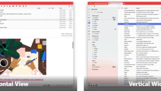
Clearly, a lot of the decisions around Vivaldi Mail and Calendar were driven by the team’s own preferences. That means, for example, that the Mail client does its best to do away with the usual folder structure of an Outlook, for example, so that its filtering system allows a message to appear in multiple views. Since Vivaldi has always been about customization, you can choose between the traditional horizontal and wide views you’re probably familiar with from other email clients. One nice feature here is that you can also control which messages you see through toggles that let you exclude emails from mailing lists and custom folders from the default view, for example. I do like the fact that Vivaldi Mail also distinguishes between unseen and unread email.
As expected, you can use virtually any email provider here that supports the IMAP and POP protocols, but there’s also built-in support for Gmail as well.
The new built-in calendar, too, supports most of the standard calendar providers, including Google Calendar and iCloud, for example. One interesting design twist here is that the team decided to show all the data available for an event right in the calendar instead of just one or two lines per event. Von Tetzchner tells me that this is very much his preference.
“I think we have done things differently. We’ll see what people think,” he said. “But one of the things I wanted with the calendar, I wanted to be able to see all the content. Typically, with the calendars that are used today, the size of the space available for the text is dependent on the timeslot size. It doesn’t need to be that way. It looks better when the time slots are even, but functionally, it’s better that you actually can read more of the text.”
Von Tetzchner noted that he obviously wants to steer users away from Google and Microsoft, but he believes that providing alternatives isn’t good enough — they have to be better alternatives.
As for the RSS reader, which is still pretty basic and doesn’t offer features like the ability to import and export lists of feeds yet, for example, the idea here is to help users leave their respective echo chambers but also avoid newsreaders that are focused on news suggestions. The overall implementation here works quite well, with the feed reader providing virtually all of the features you would need from a local feed reader. Whenever the browser finds an RSS feed as you are surfing the web, it will also highlight that in the URL bar, so subscribing to new feeds is about as easy as it gets. You can also subscribe to individual YouTube feeds (because even though YouTube doesn’t highlight this, every YouTube channel is still available as a feed).
“With feeds, it’s also about getting away from the [data] collection,” he said. “The news services now, they look at what you read and build profiles on you with the excuse that you then get more relevant news. But in my humble opinion, you subscribe to certain channels and that should be enough. We’re trying to basically give you — as a user — control over what you’re reading, what you’re subscribing to, and not learning about your habits or your preferences. Those are your habits and preferences and none of our business.”
All of this comes down to Vivaldi’s core philosophy of not being driven by advertising as its business model. “We have no need for or interest in collecting data on our users,” von Tetzchner told me (though it is collecting some basic aggregate data about how many users it has and where in the world they are). Indeed, he believes that collecting detailed telemetry about users only drives a company to build a product for the average user.
That’s also where the new translation feature comes in, which is hosted on Vivaldi’s own servers, so none of the data is shared with any third-party service. Vivaldi uses Lingvanex’s technology for this but hosts it on its own servers. The results are pretty good and for the most part, at a level comparable to Google Translate, for example (with the occasional subtle differences between the two where Google Translate would often offer the more precise translation).
One feature that very much acknowledges that everybody has different requirements from a browser — and that it might be nice to build an onramp to Vivaldi for non-power users, too — is Vivaldi’s new onboarding flow that allows users to choose between three default layouts. There’s an “essentials” view for those who only want a basic and very Chrome- or Edge-like experience, “classic” for those who want to use some of the browser’s more advanced features like panels and its status bar, and “fully loaded” for those who want access to every available tool. It’s this last view that also enables the new Vivaldi Mail, Feed Reader and Calendar features by default, too.
As of now Vivaldi isn’t profitable. It generates some revenue from preinstalled bookmarks and search engine partnerships. But von Tetzchner argues that Vivaldi just needs to increase its user base a bit more to become a sustainable company. He seems comfortable with that idea — and the fact that its per-user revenue is relatively low. “We’ve done this before and we’ve seen this work. It takes time to build a company like ours,” he said. “I hope people are liking what we’re building — that’s kind of the feel I get — people are really liking what we’re building. And then kind of gradually, we’ll get enough users to pay the bills and then we take it from there.”


